Selected Work
Wolters Kluwer
Role: UX/UI Designer
Duration: November 2021-present
Team: Cross-functional and Agile consisting of Designers, PMs, POs, BAs, Architects and Developers.
Platform: Web (desktop and responsive)
Tools: Figma, FigJam, Azure DevOps, Asana, Confluence, Miro

Intro
For the past three and a half years I have worked at Wolters Kluwer in London, UK. I work in the Tax division and create B2B SaaS products for the cloud platform to support tax professionals perform their tasks in a highly regulated industry.
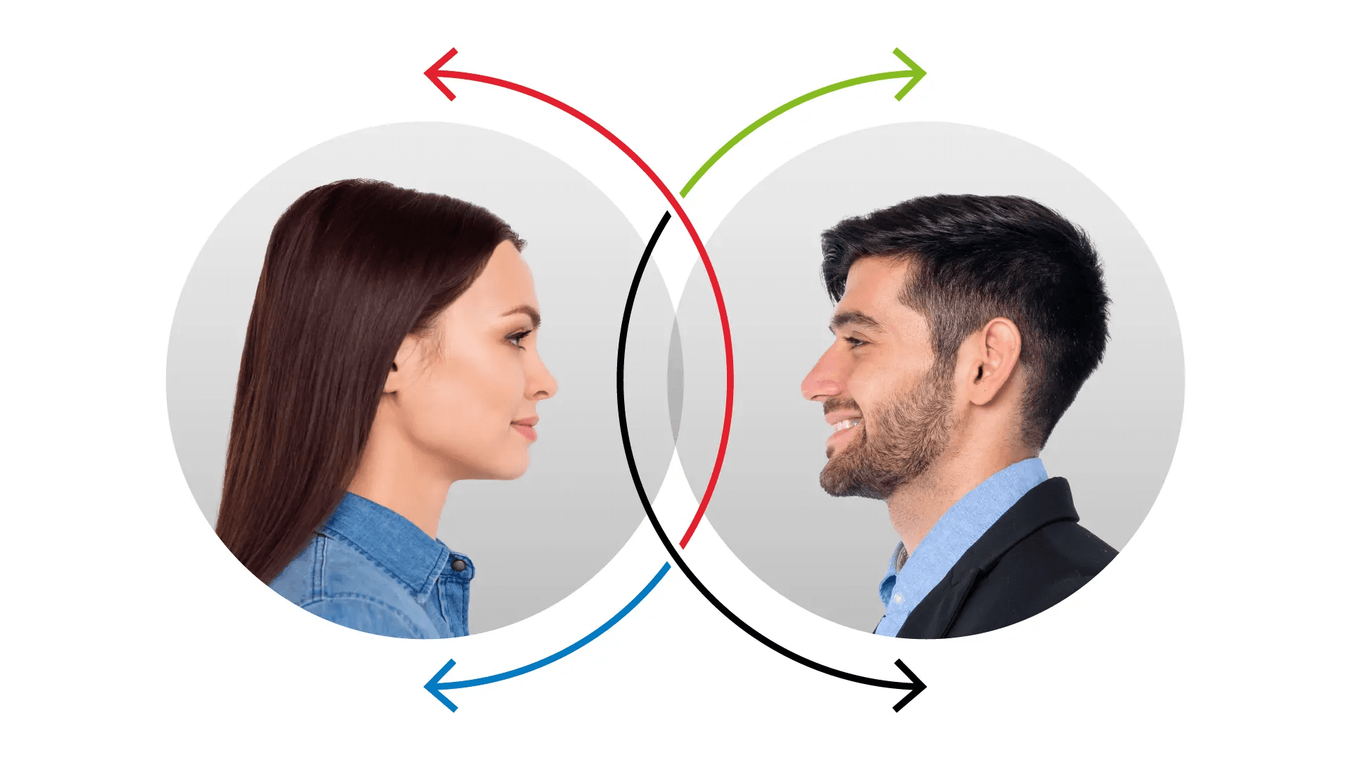
I’ve had the opportunity to dive deep into complex problems and turn them into clear, intuitive experiences. My work spans the full UX spectrum, from planning and conducting research using a mix of methods, to usability testing, journey mapping, and creating flows and prototypes. I’ve also facilitated workshops with developers, stakeholders, and the UX team to drive alignment, shape processes, and ensure technical feasibility while championing the accurate translation of design into development.
MTD
Personal Tax
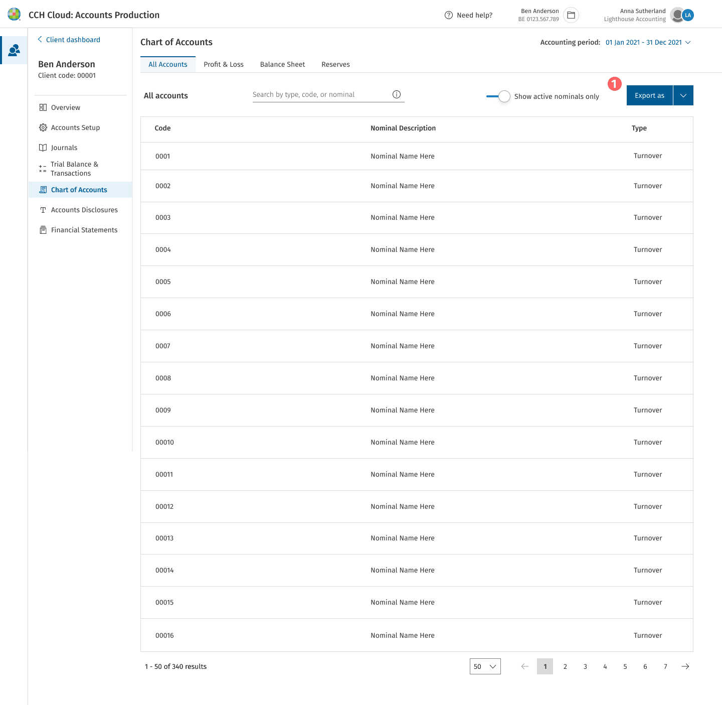
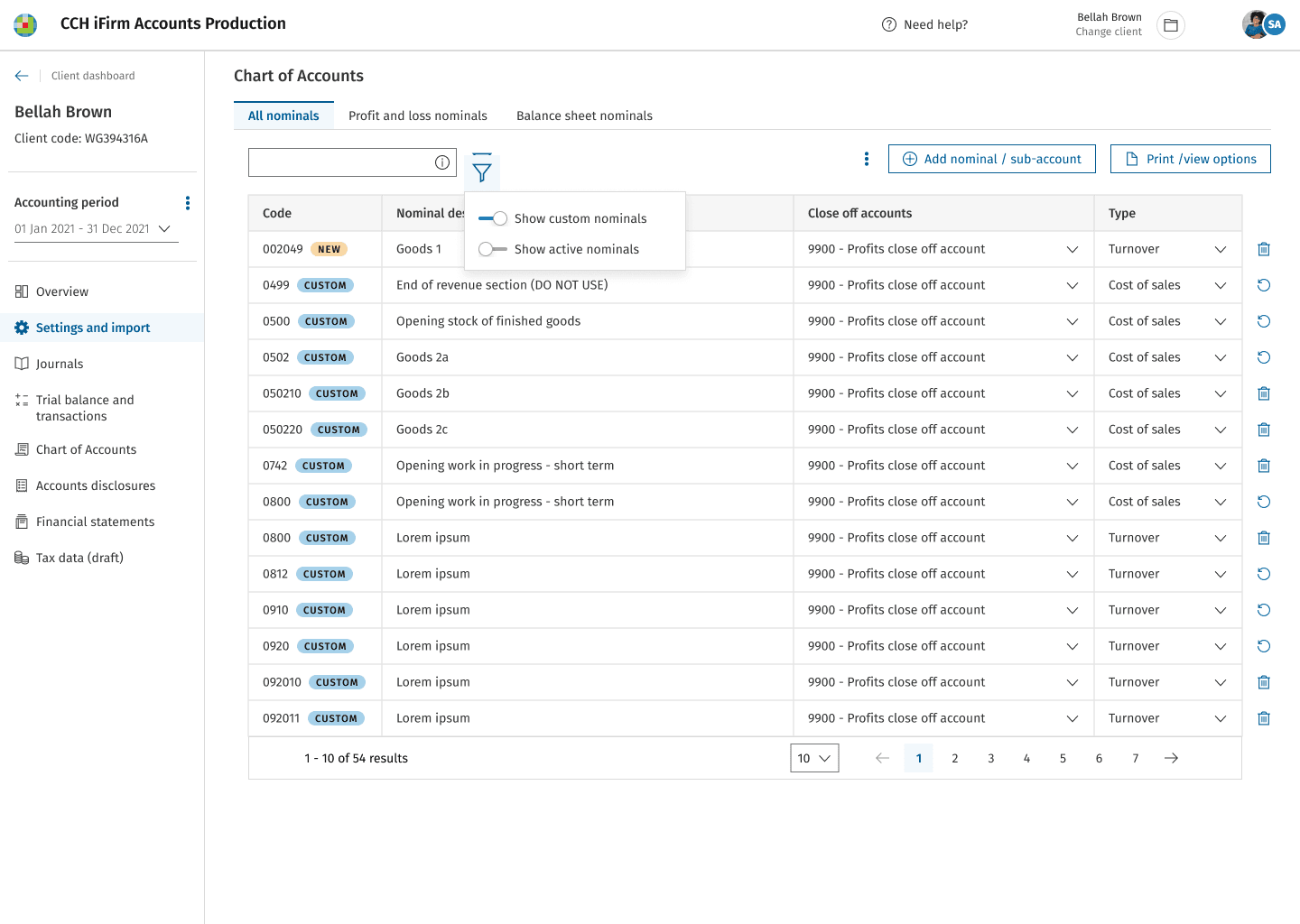
Accounts Production
Background
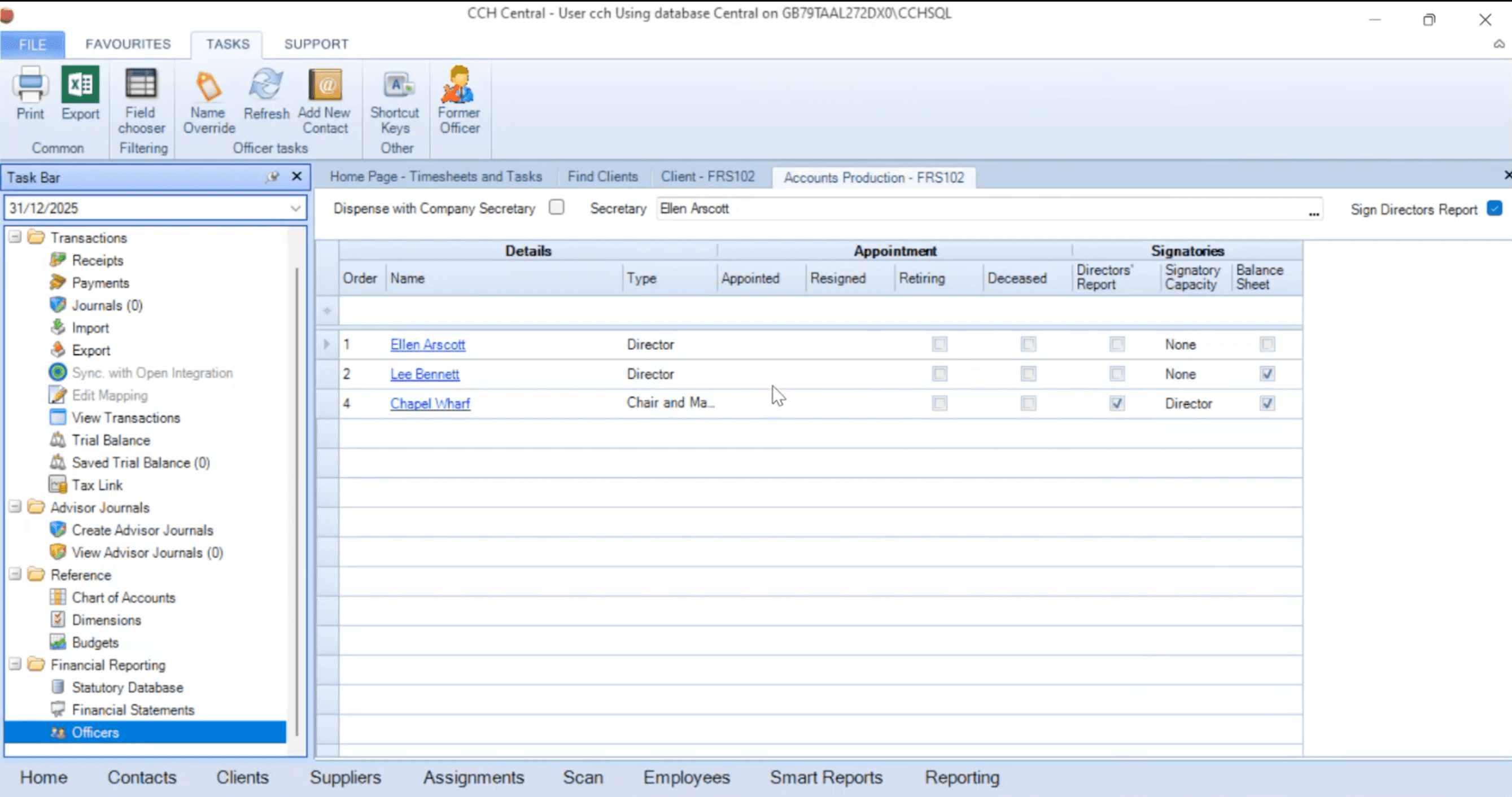
In the on-premise software, users often learn the processes by heart including the areas that they need to access to perform their tasks. Senior accountants need to provide a lot of training in onboarding and to junior designers which takes up a lot of their time between training, contacting support and carrying out their day-to-day tasks. Juniors are prone to making mistakes and the current system offers no explanations to what functions do, meaning that they rely heavily on other colleagues for guidance. Adding to that, users find it hard to remember where to go if they haven’t used the software for a while.
As we are converting the on-premise product for cloud, there were already many business assumptions and accountancy involves particular known processes and journeys. Through workshops with the wider teams, customer interviews and competitor analysis, the initial design phases started in our weekly collaborative sessions.
In the competitive market of cloud products it is vital to provide users with a cloud suite that will eventually replace the on-premise product suite. All existing product features gradually need to be available in the cloud to provide users with the ability to complete their necessary tasks.
The Goal
Design Accounts Production for cloud context.
Problems to solve
Reduce usability pain points
Reduce training time
Reduce support calls
Design Process
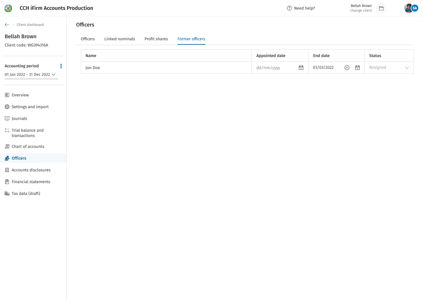
I began by refining the initial designs created by a previous designer to ensure consistency with branding, alignment with the Design System and the latest designs. Once those were brought up to standard, I moved on to designing the remaining pages and subpages required for the key user journeys and flows.
Throughout the process, we held weekly sessions with the cross-functional team, including BAs and developers, to explore use cases, uncover additional cases, and collaboratively write up scenarios and create flows. These sessions helped shift the focus from simply replicating the on-premise UI to better understanding user needs, and why and how they carried out tasks. Early on, I noticed that BAs often shared legacy screens or personal mockups expecting direct translations.

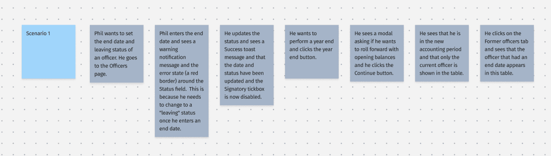
This highlighted a need for clearer alignment, so I advocated for dedicating the start of each session to use case discovery and scenario-building, ensuring the user remained central to the design process. This approach helped bring much-needed structure and direction to what had initially been a somewhat chaotic and fragmented process.
I mapped out detailed flow diagrams based on the defined scenarios before beginning any design mockups. These diagrams helped clarify the end-to-end journey and guided decisions around layout, component selection and hierarchy, ensuring that the interface aligned closely with user needs and goals.

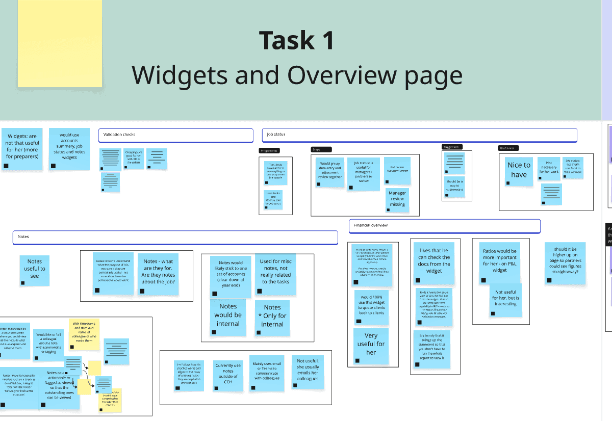
To assess how effectively users could navigate through the product and complete their tasks, usability tests were conducted across key areas. The goal was to evaluate user comprehension, task completion, and overall ease of interaction, ensuring the design supports users while also validating or challenging existing business and design assumptions.
Participants:
Existing customers and non-customers who prepare accounts in a range of small to large accountancy practices.
Testing:
One-hour interviews were conducted via Microsoft Teams, using screen sharing to observe participants completing the six tasks. Testing was carried out on Figma prototypes designed to replicate end-to-end journeys for producing year-end accounts. The prototypes provided all the needed interactions to support the specific tasks required for the tests.
Results and Feedback:
The results were analysed using affinity mapping with observations grouped by tasks, themes, common responses, and task completion time. These results were further analysed using statistics to identify patterns, highlight usability issues, and inform design recommendations.


“I’m not sure what the icons mean.”
Overall, participants understood the purpose of the Overview screen and found widgets useful, with strong feedback around enhancing validation messaging and note-taking functionality. On the Financial Statements page, iconography caused confusion, and users struggled with locating actions and interpreting interface elements. In the Mapping section, terminology was clear, but visual feedback and button placement impacted task clarity. Participants preferred a clearer year-end process and suggested more intuitive modal copy. Recommendations focused on refining interaction patterns, improving clarity, and enhancing accessibility.
Iteration:
Following the usability test, we iterated on the designs to address key pain points and enhance clarity and usability. These improvements were validated through an internal beta evaluation, which resulted in a high System Usability Scale (SUS) score of 69.3 out of 70. This gave the team confidence to move forward with testing the product among early adopter users.
“It’s useful seeing the label when I hover over the icons.”

