Selected Work

Virgin Media
Role: UX/UI Designer (Contract)
Duration: 8 months (2021)
Team: Challenger Sales (Agile): Cross-functional squad consisting of 2 Designers, 1 PM, 1 PO, 3 BAs and Developers.
Platform: Web (desktop and responsive)
Tools: Sketch, Zeplin, Azure DevOps, Slack, Confluence, Visio


Overview
Virgin Media is a leading provider of broadband, TV, mobile, and home phone services in the UK. Their website serves as a central hub for customers to explore packages, manage their services, and access support.
I joined Virgin Media as a UX/UI Designer contractor for 8 months, working on the Challenger (Sales) project, a large-scale redesign initiative to replace the legacy site with a more modern, intuitive platform. My work spanned both UX and UI design, focusing on streamlining user journeys, enhancing usability and accessibility, and creating visually cohesive, conversion-optimised interfaces across the new site.
Use case
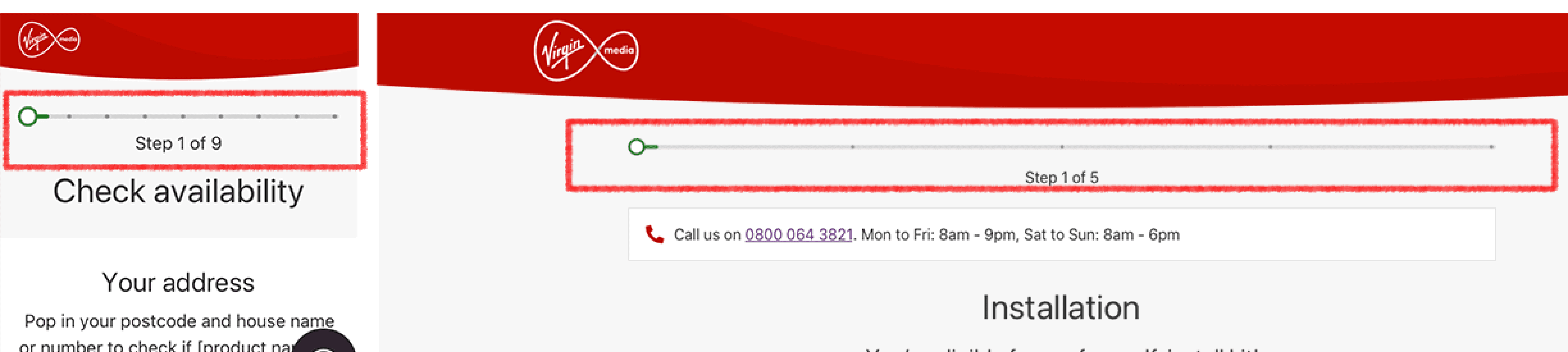
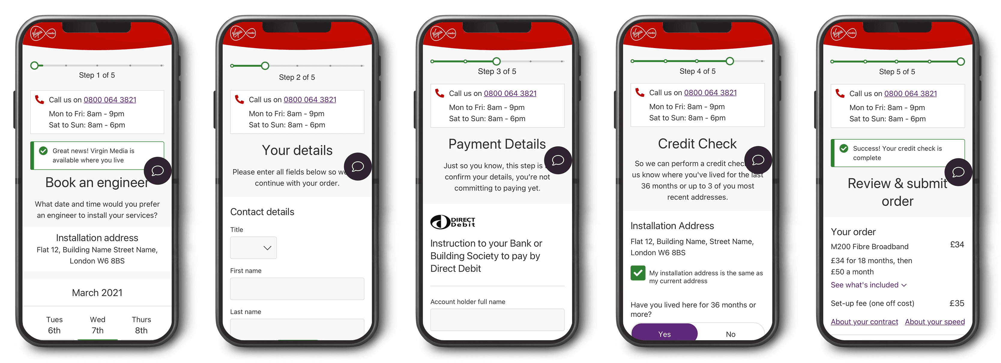
Display visual progress indicator during the checkout journey
Background
A CRO test proved that a progress bar in the basket/checkout had a positive impact on sales. The test was carried out in the quick-checkout flow. Whilst there was defined UX for that flow, there were differences in others, so it needed to be adapted to fit with other flows.
Problem
There was an absence of a clear progress indicator in the checkout journey that left users uncertain about how many steps remained. This lack of clarity contributed to high drop-off rates and low conversions.
Process
We kicked off with a stakeholder session to understand the scope of the story. Five existing flows needed to be adapted for the Challenger site. The BAs mapped out the current flows in Visio, and from there I began exploring how the journeys and scenarios would need to shift across different products. I also identified additional edge cases. I documented the updated journey steps in Confluence, and created prototypes ready for testing.
Design
The designs were responsive, created for both mobile and desktop. To build out the full user flows, I combined existing page designs with newly added screens, carefully planning the placement of the progress bar to support the user journey and checkout process. The screens were designed in Sketch and exported to Zeplin. All new UI followed the established design system and brand guidelines, using consistent components and assets to ensure a cohesive experience across the journey.
Testing
I created interactive prototypes of the updated flows, which were tested through unmoderated A/B testing led by the UX researcher in Optimal. This approach allowed us to compare user behavior between the legacy and redesigned experiences, validating the impact of the introduction of the progress bar.
Results
The redesigned checkout journey resulted in an 8% increase in completion rate, demonstrating a clear improvement in user engagement and a reduction in drop-off.

