Selected Work

eGenisys
Role: Digital / UI / UX Designer
Duration: 1 year (2018-2019)
Team: Marketing Manager, Developer, Sales
Platform: Web (desktop and responsive), Email
Tools: Adobe CS: Photoshop, Illustrator, XD and Hubspot
Overview
eGenisys was launched as the B2B/B2C e-commerce divison of Genisys Group in the UK. While the parent company primarily focused on B2B sales through outbound calls, they wanted to expand their market reach in two key directions: entering the B2C space with a digital platform and widening their B2B reach through online channels.
Built on Magento, the eGenisys site required significant UX and UI enhancements. I collaborated closely with developers to refine the overall user experience and interface. Using a logo provided by an external agency, I developed a comprehensive design system to bring consistency and trust to the new brand. Our main goals were to increase traffic, boost sales, improve customer retention, and build credibility. We also implemented targeted email marketing campaigns to grow and engage our customer base.
Use case
Increase click-through rates from email campaigns.
Background
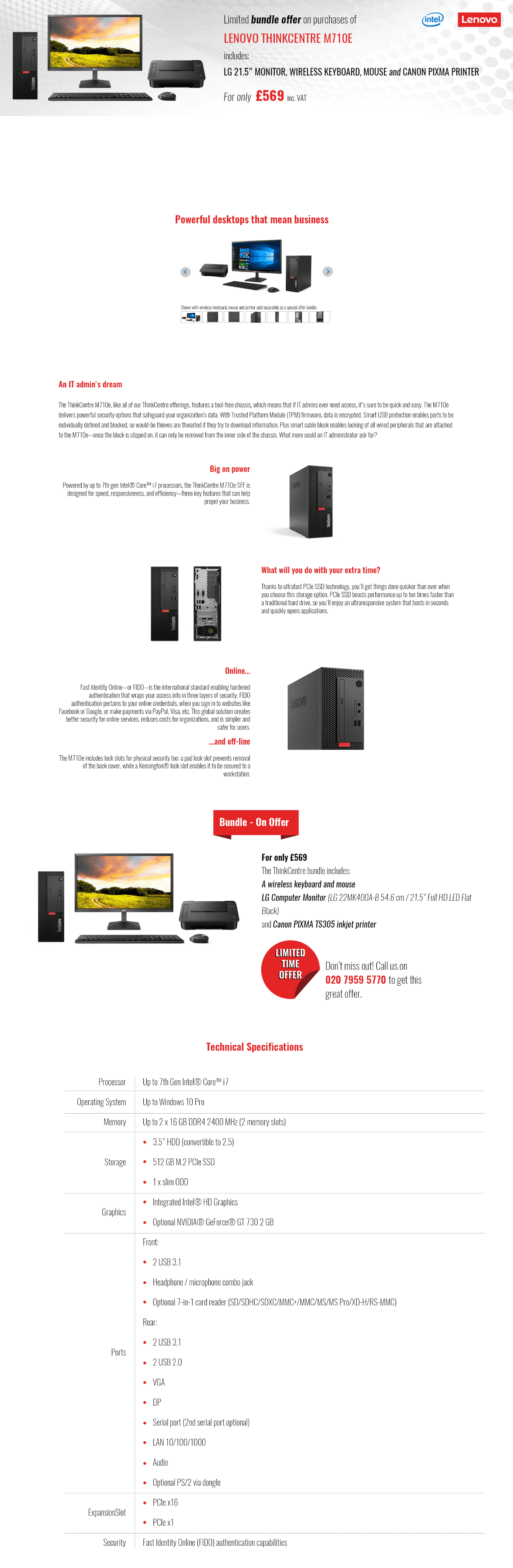
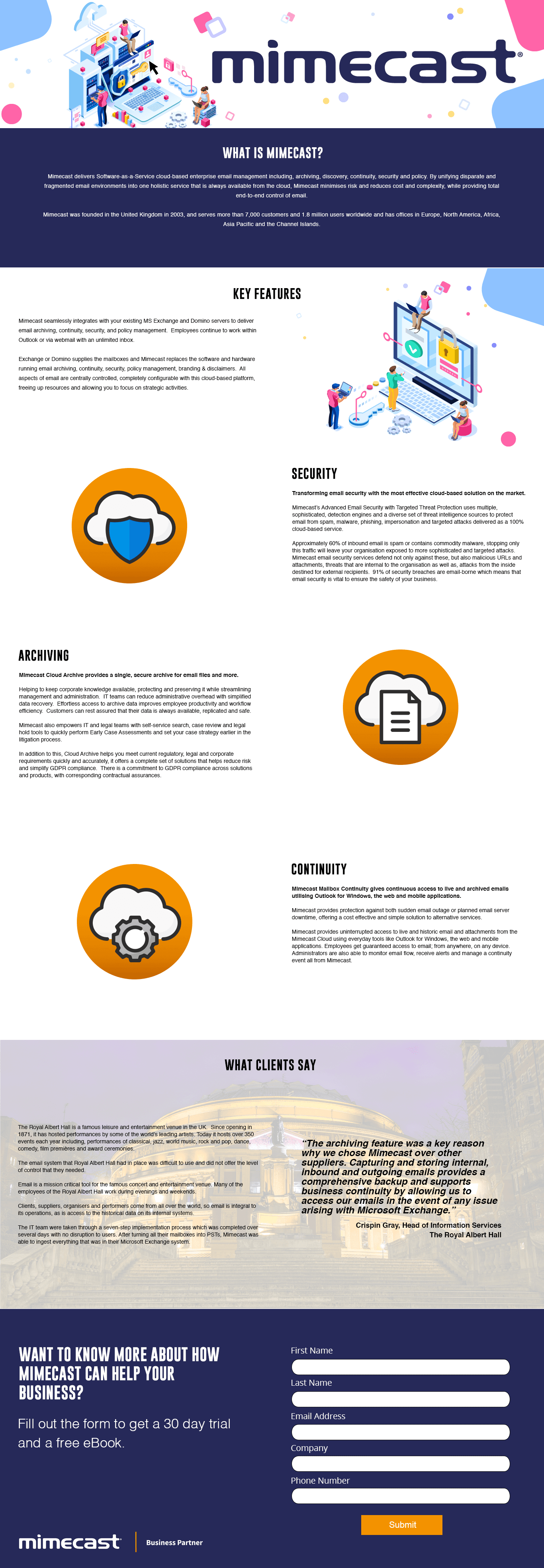
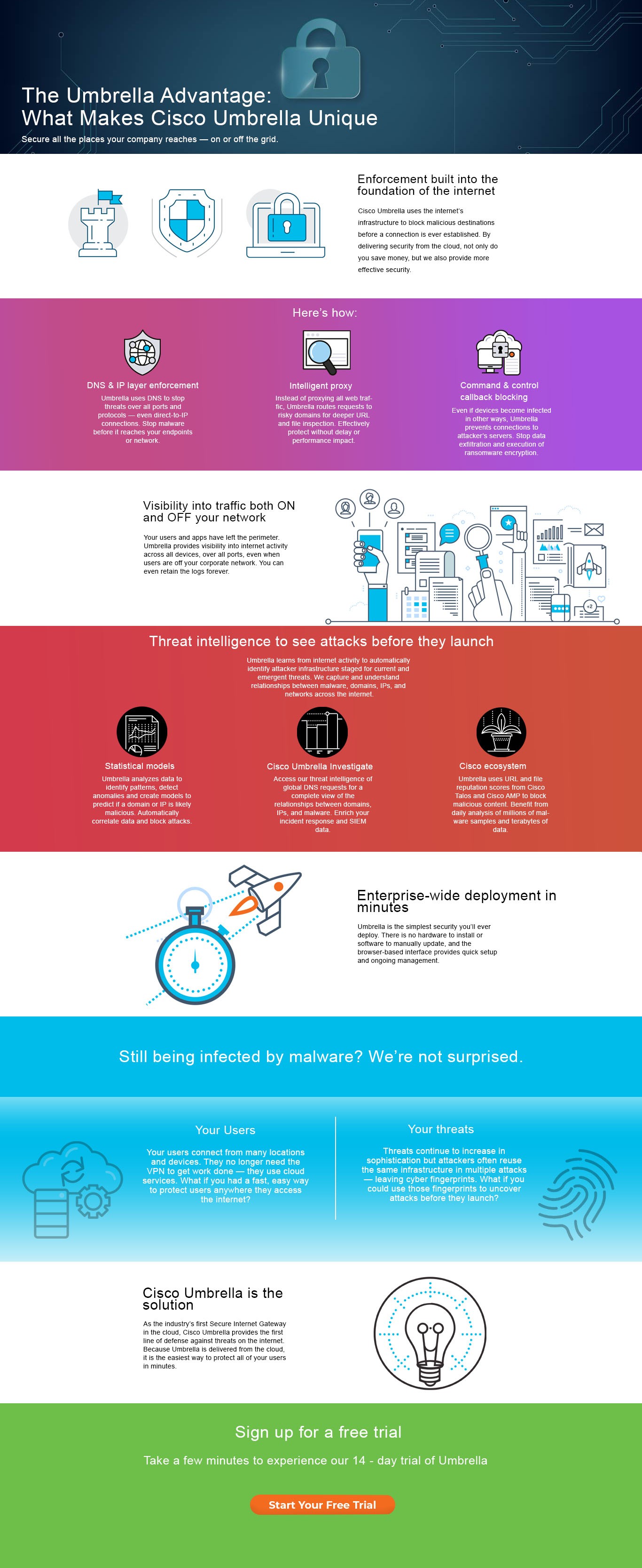
We partnered with brands such as Lenovo and Kyocera to run promotions that required driving traffic to both the eGenisys site and dedicated landing pages.
Problem
Our email campaigns were underperforming—low open rates, poor engagement, and high unsubscribe rates. Many recipients were deleting emails without reading them. By analysing heatmaps and scroll data, we identified drop-off points and areas that drew attention, helping us understand user behavior and opportunities for improvement.
Goal
Restructure email content and visual hierarchy to improve engagement, encourage click-throughs, and drive revenue, either through site visits or direct contact with sales.
Process
Using Hubspot analytics, we reviewed click maps to pinpoint hotspots and cold zones in our campaigns. This data guided our decisions on layout, messaging, and content structure.
Improved email structure

Design
We created fully responsive email templates aligned with the website’s look and feel. Using shared assets and design elements ensured a cohesive brand experience. I reorganised content to surface key value propositions, such as “Next day delivery”, and introduced mini-banners to highlight promotions. I also added visible contact numbers to reinforce credibility and make it easy for users to reach sales directly.


Testing
We ran A/B tests on email layouts with different content hierarchies. Each iteration incorporated small tweaks informed by performance data to optimise engagement and click-through behaviour.
Results
Redesigning the content and hierarchy led to a 9% increase in scroll depth and a 4% boost in click-through rates to the website.
Landing Pages

Homepage


