Selected Work

Revital
Role: Product Designer (Contract)
Duration: 3 months (2020)
Team: Visual Designers and Marketing Manager
Platform: Web (desktop and responsive)
Tools: Sketch, Adobe Photoshop and Illustrator


Overview
Revital is a UK-based health and wellness brand that began as a mail-order service in 1991. Over time, it expanded to 18 retail stores across the South East, offering vitamins, supplements, natural beauty products, and health foods. As consumer habits evolved and with rising competition from modern wellness retailers, the company sought to reimagine its online presence in both B2B and B2C, to better serve both its loyal customer base and attract new customers.
Background
The original Revital website had evolved organically over the years, resulting in a fragmented and inconsistent user experience. Without a clearly defined user journey, the site had accumulated a number of redundant and poorly structured sections, making navigation confusing and unintuitive for customers. Key product categories were buried or duplicated, leading to decreased visibility and, ultimately, lost sales due to a lack of discoverability.
I was brought in as the Product Designer on a contract basis, to lead the end-to-end redesign of the platform.
Goal
Improve the user experience and simplify the customer journey from landing to conversion. This included enhancing retention among existing customers while also supporting the acquisition of new ones. A key objective was to drive increased engagement and boost online revenue, all while establishing a more cohesive and consistent digital brand presence that aligned to other touchpoints, in-store, social and advertising. Additionally, the redesign aimed to reduce the volume of customer service inquiries by providing clearer, more informative content, particularly on product pages, to address frequently asked questions and improve overall site usability.
Problems to solve
The existing website presented a number of usability and structural challenges that negatively impacted the customer experience. There was no clearly defined user journey, which often led to frustration, confusion, and high abandonment rates. Navigation was unintuitive, with disorganised content, duplicated or hidden sections, and long, unstructured product lists that made browsing overwhelming.
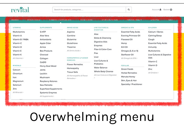

Key selling points such as, Free UK Delivery and the Revital Rewards programme, were not clearly highlighted, and there were no dedicated areas to showcase ongoing campaigns or promotional offers. Additionally, accessibility was lacking across the site, further limiting ease of use and contributing to a fragmented experience that failed to support user needs or drive conversions. Another key issue was the high volume of customer service queries, often caused by a lack of product information, highlighting the need for more informative content throughout the site.
Selected Work
Revital
Role: Product Designer (Contract)
Duration: 3 months (2020)
Team: Visual Designers and Marketing Manager
Platform: Web (desktop and responsive)
Tools: Sketch, Adobe Photoshop and Illustrator

Overview
Revital is a UK-based health and wellness brand that began as a mail-order service in 1991. Over time, it expanded to 18 retail stores across the South East, offering vitamins, supplements, natural beauty products, and health foods. As consumer habits evolved and with rising competition from modern wellness retailers, the company sought to reimagine its online presence in both B2B and B2C, to better serve both its loyal customer base and attract new customers.
Background
The original Revital website had evolved organically over the years, resulting in a fragmented and inconsistent user experience. Without a clearly defined user journey, the site had accumulated a number of redundant and poorly structured sections, making navigation confusing and unintuitive for customers. Key product categories were buried or duplicated, leading to decreased visibility and, ultimately, lost sales due to a lack of discoverability.
I was brought in as the Product Designer on a contract basis, to lead the end-to-end redesign of the platform.
Goal
Improve the user experience and simplify the customer journey from landing to conversion. This included enhancing retention among existing customers while also supporting the acquisition of new ones. A key objective was to drive increased engagement and boost online revenue, all while establishing a more cohesive and consistent digital brand presence that aligned to other touchpoints, in-store, social and advertising. Additionally, the redesign aimed to reduce the volume of customer service inquiries by providing clearer, more informative content, particularly on product pages, to address frequently asked questions and improve overall site usability.
Problems to solve
The existing website presented a number of usability and structural challenges that negatively impacted the customer experience. There was no clearly defined user journey, which often led to frustration, confusion, and high abandonment rates. Navigation was unintuitive, with disorganised content, duplicated or hidden sections, and long, unstructured product lists that made browsing overwhelming.
Key selling points such as, Free UK Delivery and the Revital Rewards programme, were not clearly highlighted, and there were no dedicated areas to showcase ongoing campaigns or promotional offers. Additionally, accessibility was lacking across the site, further limiting ease of use and contributing to a fragmented experience that failed to support user needs or drive conversions. Another key issue was the high volume of customer service queries, often caused by a lack of product information, highlighting the need for more informative content throughout the site.
Design Process
Due to the short turnaround time of only 3 months, I used research that was gathered for 2 years prior to me starting. I did further user research using the tools Metrilo and Auryc and I also observed click maps and screen recordings of customers to gain more insight into their mental model and buying behaviour. I also gained a more detailed insight into the customer experience by asking members of various teams: customer service, mail order, delivery, warehouse, and marketing team, to have a thorough understanding of the customer touchpoints and experiences. The marketing strategy that I was provided incorporated the business needs.
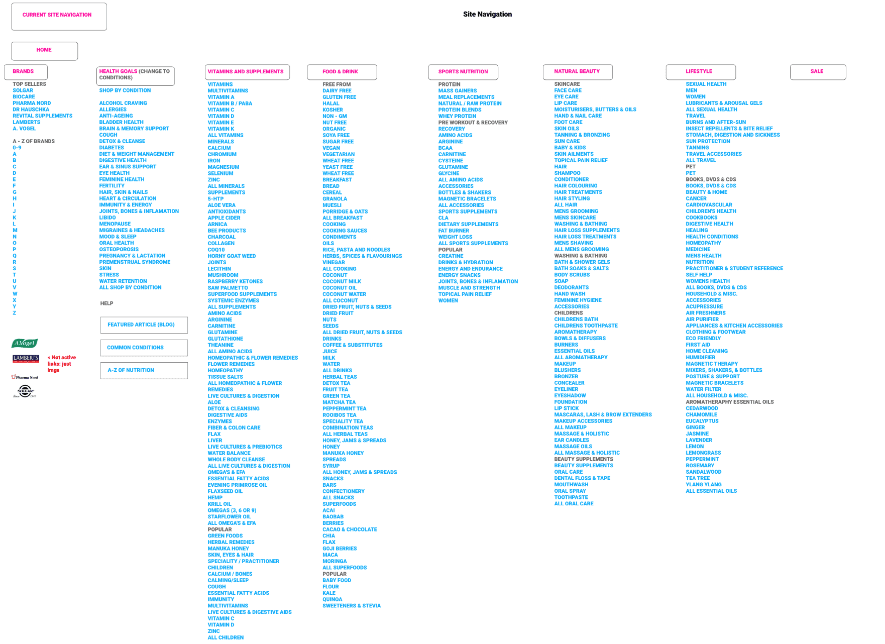
The research supplied to me helped me gain more understanding how the navigation could be better organised to support the user journey, it listed the Top Categories, Top Products, Top Brands, Top Pages On-Site and Popular search terms. I further supported this research by using the sitemap tool Dynomapper, which created a visual site map displaying the website hierarchy. It was a helpful tool because of the vastness of navigation items.
Using stickies, we did card sorting internally to understand how navigation items should be grouped logically and organised hierarchically. Then we did journey mapping with the stickies and site map labels to gain more understanding into user flows.

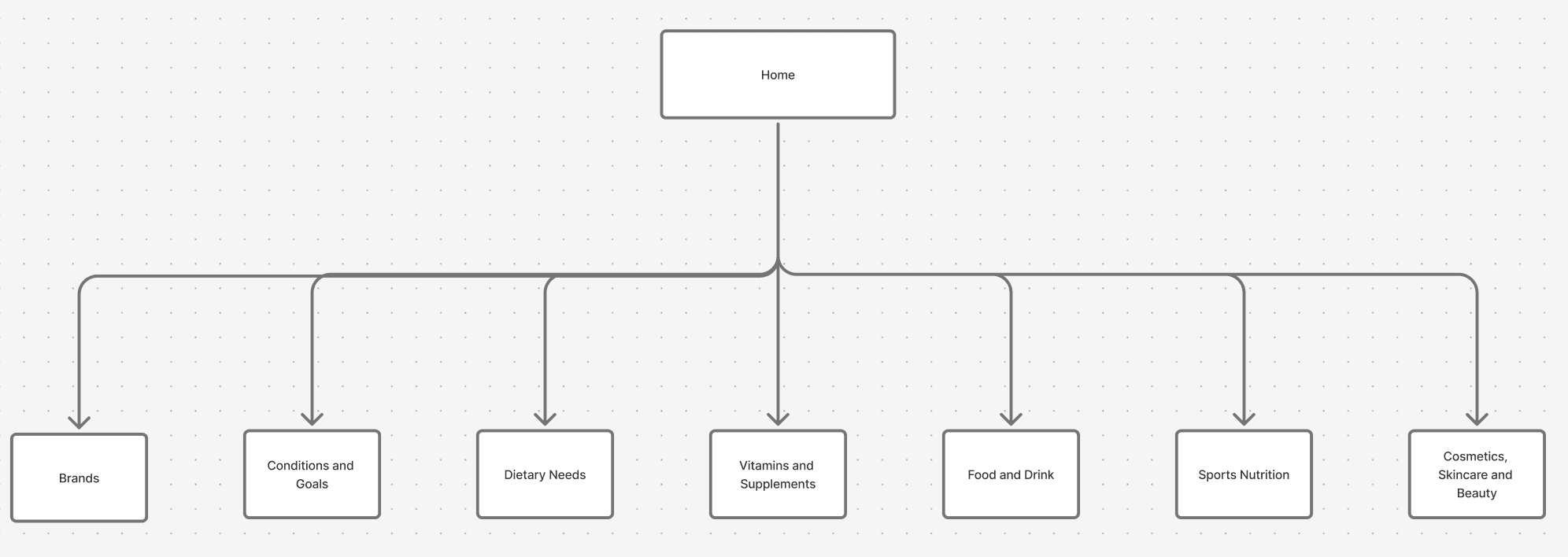
After analysing this data along with the site structure and pages and breaking those down into 8 - 9 main sections, I realised that most of the subcategories and pages could be grouped under these main categories, rather than being duplicated under various other categories.
Design Process
Due to the short turnaround time of only 3 months, I used research that was gathered for 2 years prior to me starting. I did further user research using the tools Metrilo and Auryc and I also observed click maps and screen recordings of customers to gain more insight into their mental model and buying behaviour. I also gained a more detailed insight into the customer experience by asking members of various teams: customer service, mail order, delivery, warehouse, and marketing team, to have a thorough understanding of the customer touchpoints and experiences. The marketing strategy that I was provided incorporated the business needs.
The research supplied to me helped me gain more understanding how the navigation could be better organised to support the user journey, it listed the Top Categories, Top Products, Top Brands, Top Pages On-Site and Popular search terms. I further supported this research by using the sitemap tool Dynomapper, which created a visual site map displaying the website hierarchy. It was a helpful tool because of the vastness of navigation items.
Using stickies, we did card sorting internally to understand how navigation items should be grouped logically and organised hierarchically. Then we did journey mapping with the stickies and site map labels to gain more understanding into user flows.
After analysing this data along with the site structure and pages and breaking those down into 8 - 9 main sections, I realised that most of the subcategories and pages could be grouped under these main categories, rather than being duplicated under various other categories.
I then created lo-fi mockups of the new layout and organisation of sections for the homepage and other pages. The branding had recently been done by an external agency and I created the design system of assets and components and ensured it aligned to the branding.
Once this had been signed off I began to create hi-fi mockups of the site design.
Results
The redesign resulted in a significantly improved user experience, with clearer structure, better navigation, and a more intuitive customer journey from entry to conversion.
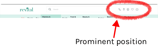
Key functionality, such as the store locator, account section, cart, and support telephone number, was relocated to a prominent position above the main menu, ensuring quicker access to essential tools.
Space at the top of the page was better utilised to highlight important but non-sales-focused content such as “Free UK Delivery” and “Revital Rewards.” As a core unique selling point (USP), the Revital Rewards program was made more prominent through an interactive hover popup that briefly explains the scheme—removing the need for a full homepage section and freeing up space for promotional content.
Navigation across the site was simplified and reorganised, eliminating duplicate or buried pages that had accumulated over time. Frequently accessed sections like “Brands,” which were previously hidden in deep menus, were surfaced directly on the homepage to reduce friction and improve discoverability.

The homepage was decluttered and restructured to guide users more effectively, introducing a story-like flow that helped surface relevant content and product recommendations in a more personal and engaging way.
The hero banner was redesigned to spotlight key campaigns, offers, and priority products, giving marketing initiatives greater visibility. Additionally, a new “Popular Categories” section was introduced just beneath the header image, allowing users to quickly navigate to key areas without relying solely on dropdown menus—streamlining access and improving engagement from the outset.

Results
The redesign resulted in a significantly improved user experience, with clearer structure, better navigation, and a more intuitive customer journey from entry to conversion.
Key functionality, such as the store locator, account section, cart, and support telephone number, was relocated to a prominent position above the main menu, ensuring quicker access to essential tools.
Space at the top of the page was better utilised to highlight important but non-sales-focused content such as “Free UK Delivery” and “Revital Rewards.” As a core unique selling point (USP), the Revital Rewards program was made more prominent through an interactive hover popup that briefly explains the scheme—removing the need for a full homepage section and freeing up space for promotional content.
Navigation across the site was simplified and reorganised, eliminating duplicate or buried pages that had accumulated over time. Frequently accessed sections like “Brands,” which were previously hidden in deep menus, were surfaced directly on the homepage to reduce friction and improve discoverability.
The homepage was decluttered and restructured to guide users more effectively, introducing a story-like flow that helped surface relevant content and product recommendations in a more personal and engaging way.
Collectively, these changes not only enhanced usability but also created a more cohesive and conversion-focused e-commerce experience aligned with modern retail standards.


Available for mentoring and coaching
This site was designed in Figma and built in Framer
spillay.co.uk, 2025®
Available for mentoring and coaching
This site was designed in Figma and built in Framer
spillay.co.uk, 2025®
Available for mentoring and coaching
This site was designed in Figma and built in Framer
spillay.co.uk, 2025®
Design Process
Due to the short turnaround time of only 3 months, I used research that was gathered for 2 years prior to me starting. I did further user research using the tools Metrilo and Auryc and I also observed click maps and screen recordings of customers to gain more insight into their mental model and buying behaviour. I also gained a more detailed insight into the customer experience by asking members of various teams: customer service, mail order, delivery, warehouse, and marketing team, to have a thorough understanding of the customer touchpoints and experiences. The marketing strategy that I was provided incorporated the business needs.
The research supplied to me helped me gain more understanding how the navigation could be better organised to support the user journey, it listed the Top Categories, Top Products, Top Brands, Top Pages On-Site and Popular search terms. I further supported this research by using the sitemap tool Dynomapper, which created a visual site map displaying the website hierarchy. It was a helpful tool because of the vastness of navigation items.